Brooklyn Museum Rebrand
NYC Newswire
Brooklyn Museum Rebrand
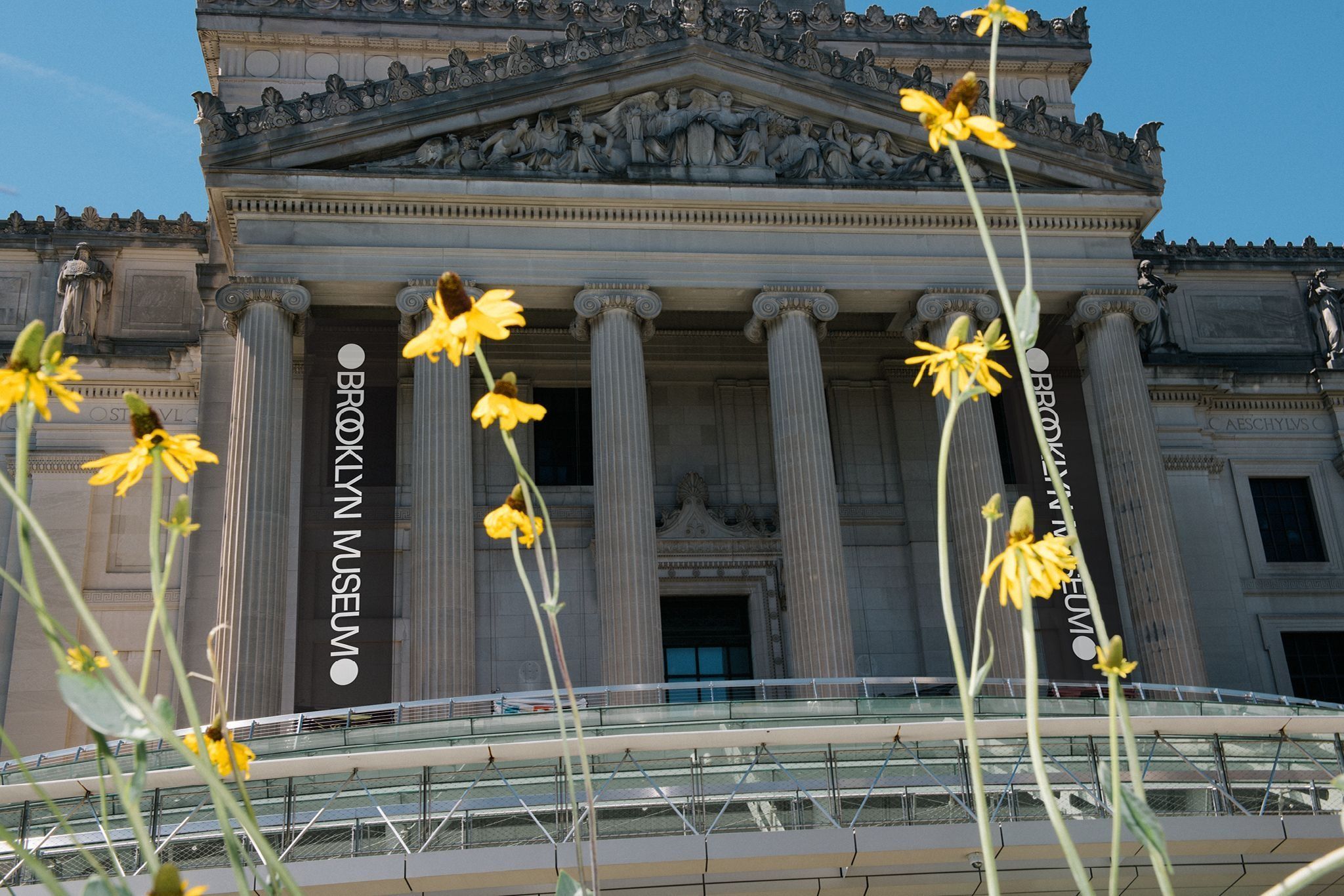
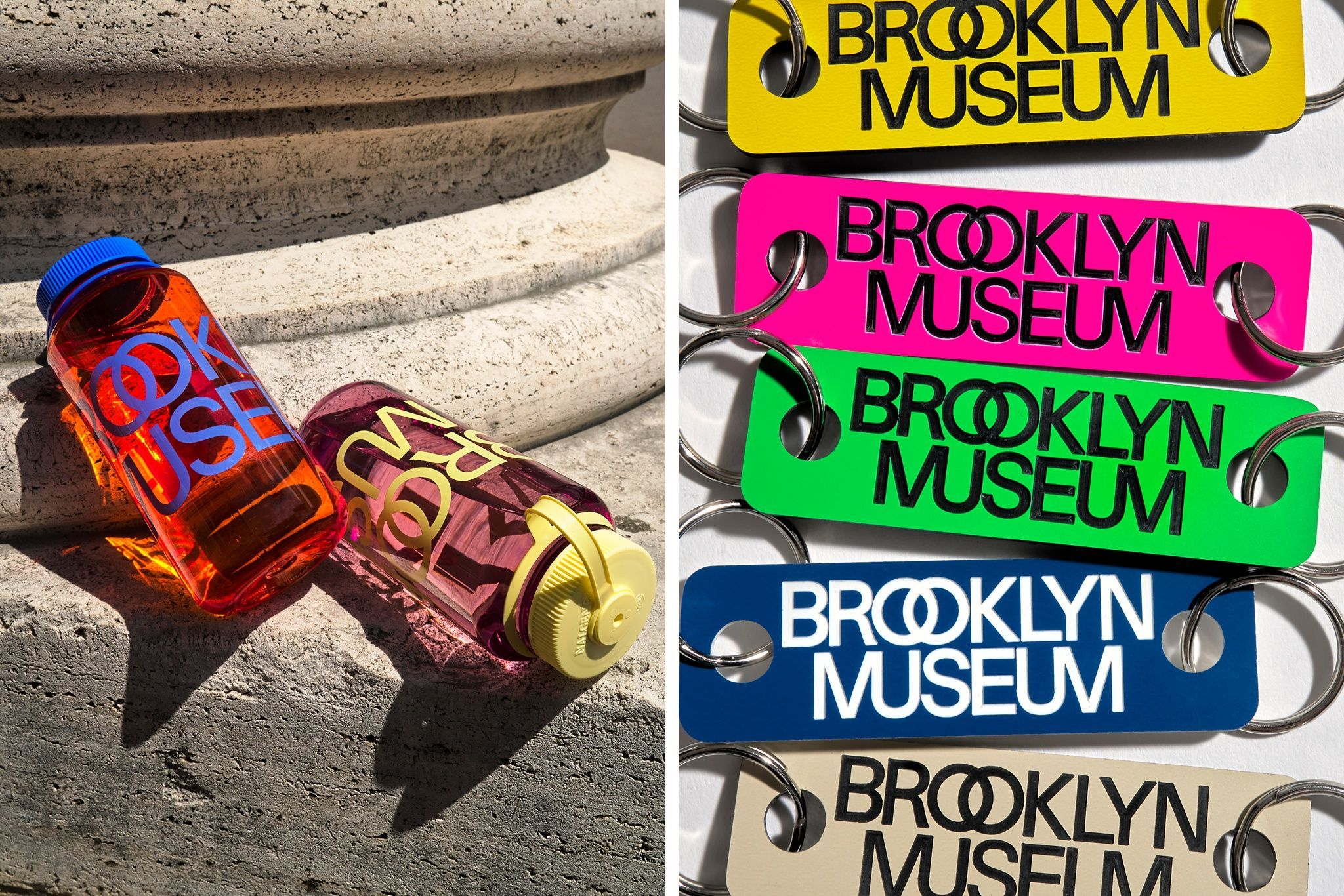
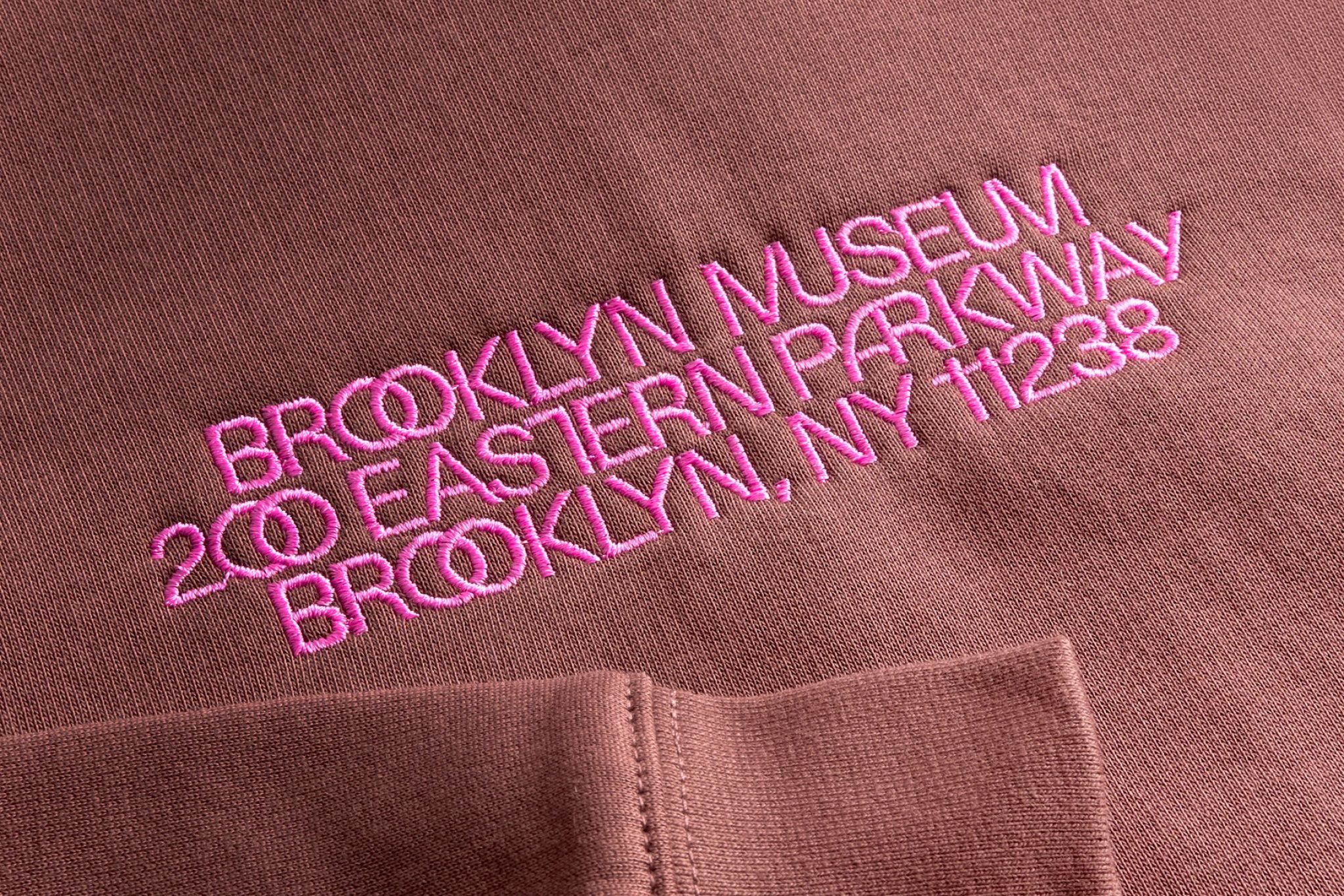
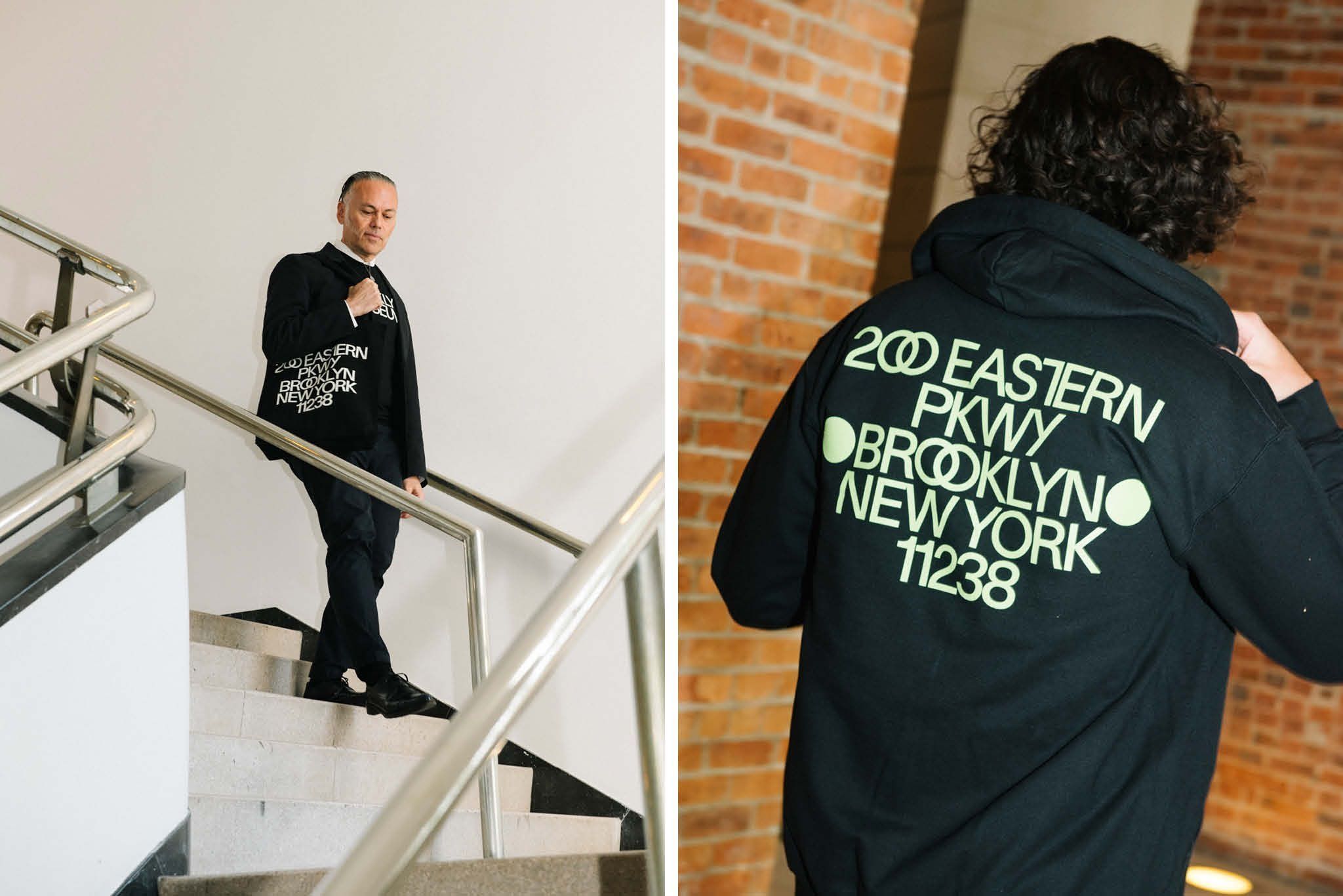
The Brooklyn Museum is pleased to unveil a refreshed brand on the occasion of its 200th anniversary. The new logo and visual identity reflect and celebrate the past while bringing us boldly into the future. This rebrand marks an exciting new chapter, as the updated look is rolled out throughout the fall via new signage and collateral, a digital campaign, a new website, and a suite of exclusive merchandise.
“The ways that audiences are engaging with museums are expanding, and we needed a new brand that meets the demands of the day, honors our rich history, and brings a whole lot of energy. And there’s no better time to launch it than our 200th anniversary!” says Anne Pasternak, Shelby White and Leon Levy Director of the Brooklyn Museum.
Brooklyn Museum Rebrand
NYC Newswire
Brooklyn Museum Rebrand

Brooklyn Museum Rebrand
NYC Newswire
Brooklyn Museum Rebrand
The new visual identity reflects these two centuries of history. In particular, the brand looks to the Museum’s iconic building, considering its evolution from an original neoclassical design by McKim, Mead & White to its moves toward modernism in the 1930s, to recent projects that have created more open and welcoming spaces. The brand draws on these elements from our past and unites them with our identity today as a contemporary institution.
Brooklyn Museum Rebrand
NYC Newswire
Brooklyn Museum Rebrand

Brooklyn Museum Rebrand
NYC Newswire
Brooklyn Museum Rebrand
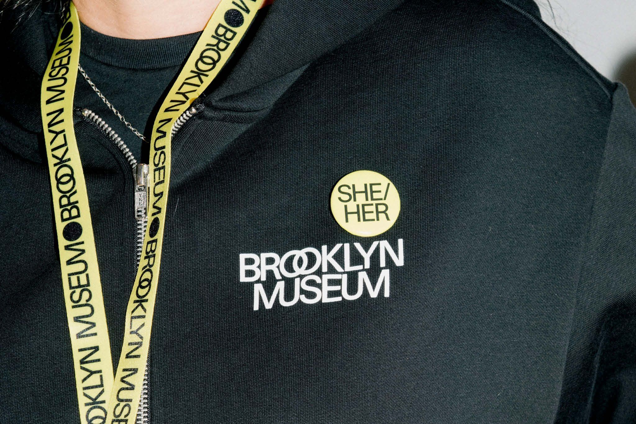
This is accomplished through an approachable, modern sans serif typeface and ligatures that express the Museum’s multidimensionality—especially within the new logo. Two dots, inspired by those that frame the names of ancient philosophers, playwrights, and poets across the building’s facade, now bookend the logo and text throughout the Museum. This reference to writers and thinkers links to our beginnings as a library and to the intersectional nature of the arts.
Brooklyn Museum Rebrand
NYC Newswire
Brooklyn Museum Rebrand

Brooklyn Museum Rebrand
NYC Newswire
Brooklyn Museum Rebrand
In every application, the dots appear at least twice, an echo of the two O’s in Brooklyn. They can be activated in motion graphics, used as bullets in text or as functional features in signs, and occasionally replaced with symbols or illustrations to add meaning or a sense of play. In addition, we now intertwine the double O’s in Brooklyn and merge the M’s and U’s in Museum.
The new palette includes a range of grays, paying homage to our limestone building, as well as brighter, more saturated hues, lending a distinctly Brooklyn vibe. The two dots, overlapping letters, and kaleidoscopic colors all convey the Brooklyn Museum’s identity as a place where a multiplicity of ideas, identities, and points of origin converge. These design elements nod to the encyclopedic collection as well as the interconnected roles the Museum plays for its multifaceted audiences: art museum, educational center, forum for ideas, weekend hotspot, and many more.
Brooklyn Museum Rebrand
NYC Newswire
Brooklyn Museum Rebrand

Brooklyn Museum Rebrand
NYC Newswire
Brooklyn Museum Rebrand
The visual identity was designed by Other Means, a Brooklyn-based graphic design studio, with the integral collaboration and support of in-house graphic designers. After more than a year of audience research and essential discussions with staff and key stakeholders, the new brand captures the diverse perspectives that make the Brooklyn Museum an icon.


